9.23.2025
Retail is not simply merchandising plus a cash wrap anymore. Your space is a content studio, a logistics node for buy online and pick up in store, a retail media platform, a wellness environment, a community gallery, and a precise sensor that informs the rest of your network. Great space planning pulls these roles into a single coherent choreography. In dense East Coast markets such as New York City, Newark, Philadelphia, and Chicago, where buildings have character and constraints, success depends on using every cubic foot with intent, and on designing spaces that learn and flex.
At HH Designers, an interior design firm specializing in luxury retail, we build flagships and rollouts that read like high craft and operate like high tech. Below are eleven advanced planning practices that create an experience customers remember and a platform your team can actually run.
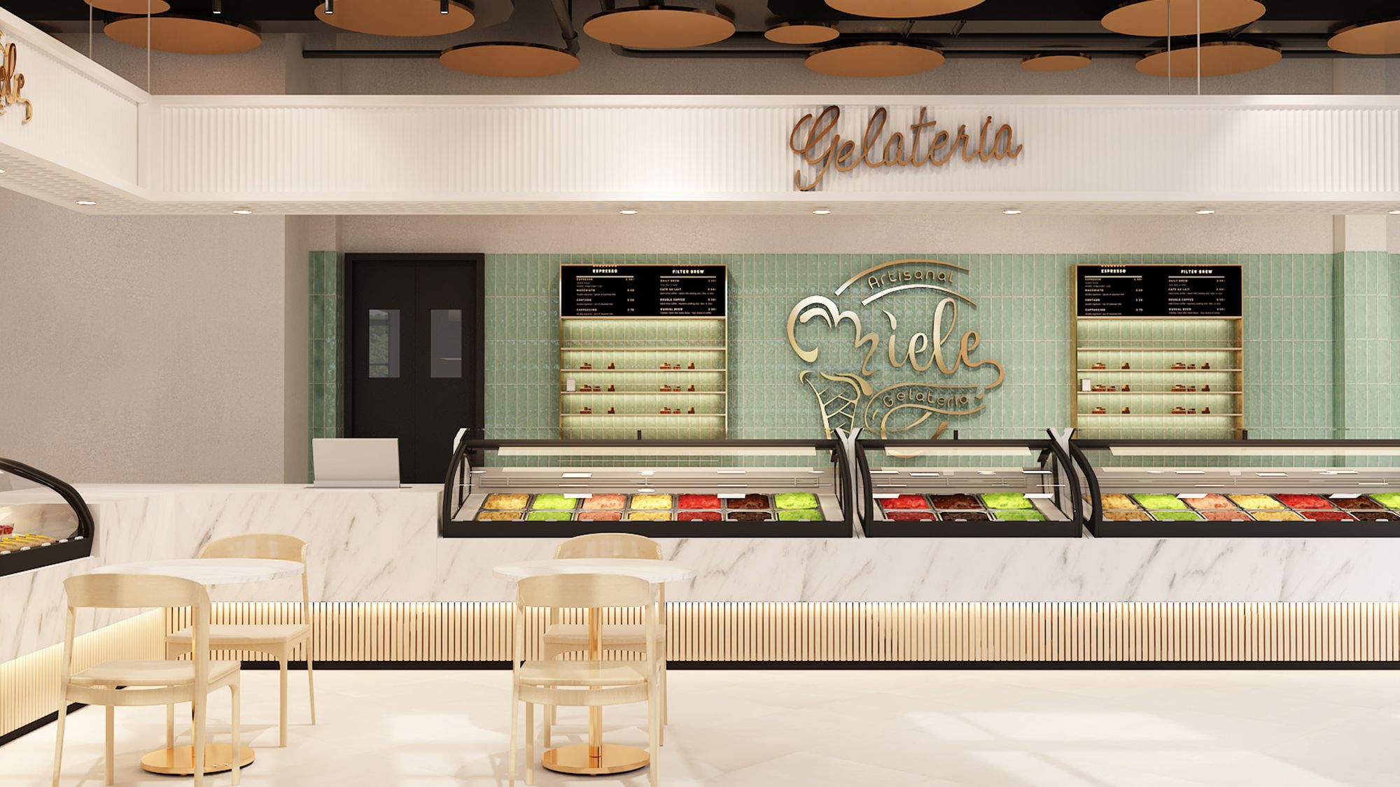
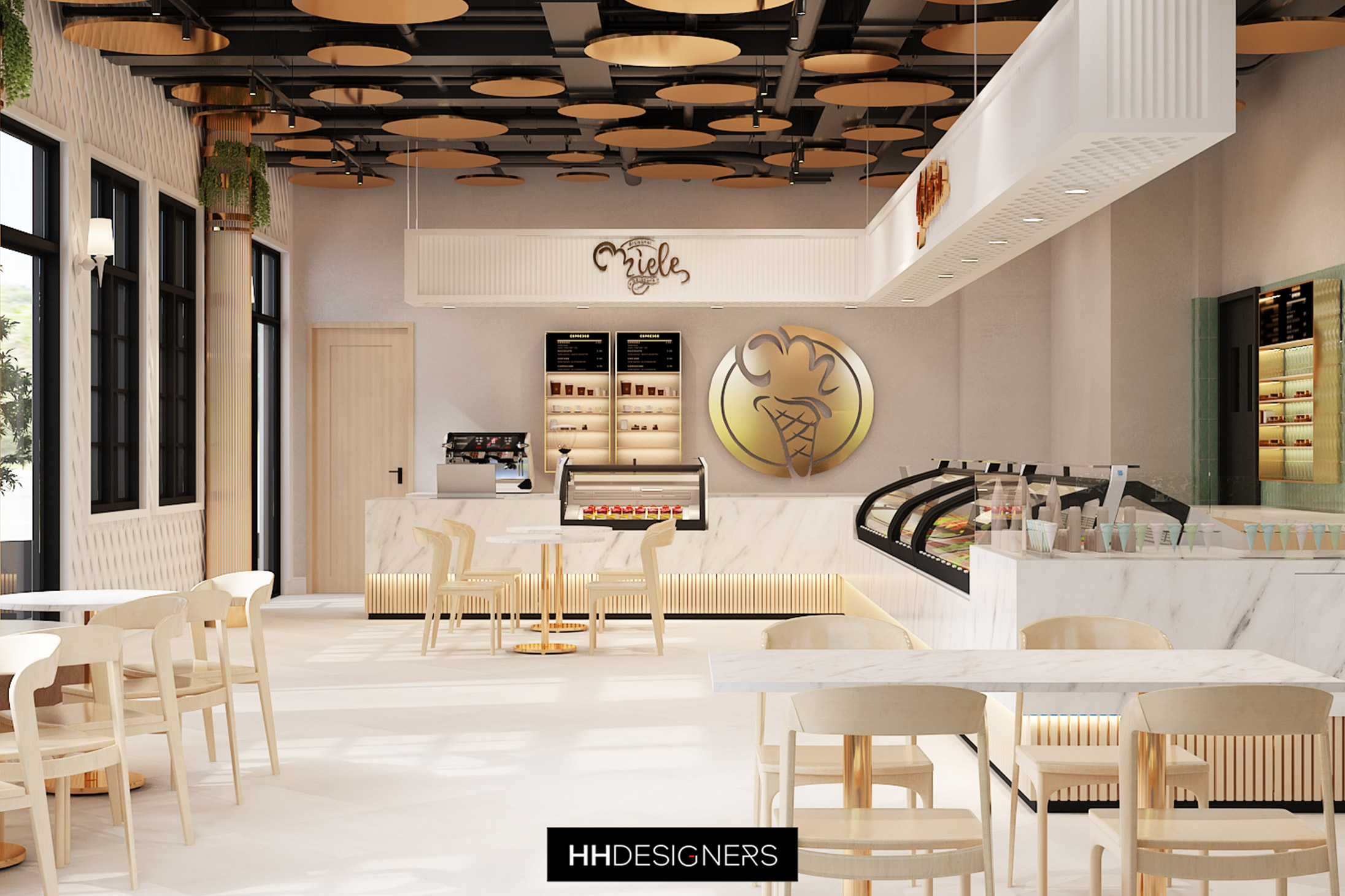
Traditional planograms push products. World-class plans choreograph behaviors. Begin with a behavior map, not a floorplan. Track the sequence you want to see: arrival, slow down, discover, touch, try, decide, share, purchase, return, rebook. Then let that choreography drive the plan.
Modern moves
Why it works
The Retail Design Institute highlights dwell-time gains when circulation aligns with intent, rather than a rigid grid. The National Retail Federation’s research library includes studies on in-store pathing that correlate exposure with conversion. Design the movement first, then lay in fixtures that support that movement.
East Coast lens
In SoHo and Old City Philadelphia, columns and odd bays are common. Use those columns as anchors for diagonal sightlines and pause points, rather than fighting them with straight rows that create dead ends.
Checklist
The decompression zone is not dead space, it is a stage. Shape the first 30 seconds with light gradients, soundscapes, temperature comfort, and scent, so the body relaxes and attention focuses.
Modern moves
Proof points
Warm light on faces, high color rendering on product, and consistent sound pressure levels correlate with longer dwell and better mood. For sustainability and cost, reference ENERGY STAR guidance for buildings when selecting drivers, controls, and schedules.
East Coast lens
Chicago winters punish vestibules. Invest in air curtains and sealed thresholds so your entry cue is comfort, not a gust. In Newark loft conversions, larger doors invite a double height light moment, which is perfect for a brand statement wall.
Checklist
Campaigns change fast. You need a space that can pivot overnight, without trades and without dumpsters. A modular kit saves time, labor, and waste, and it keeps creative teams brave because change is easy.
Modern moves
Circular benefit
Modularity reduces demolition waste and extends product life, which supports ESG goals advocated by the U.S. Green Building Council. USGBC’s credit language for material reuse and durability provides vocabulary to document the business case.
East Coast lens
Tight back-of-house, common in Manhattan and Center City, demands fast resets. A good kit allows a two-person team to refresh a full bay in under ten minutes.
Checklist
Technology should disappear into the scene, then appear exactly when useful. The result feels like hospitality, not a gadget demo.
Modern moves
Privacy by design
When you add sensors or computer vision, apply privacy engineering patterns from the National Institute of Standards and Technology so your measurement is transparent, minimal, and secure.
East Coast lens
In Philadelphia brownstones, bandwidth and power in thick walls can be tricky. Pre-wire during build out, terminate in accessible raceways, and avoid visible conduits.
Checklist
Space planning often hides service in the back. The modern store makes service a show. People do not only buy, they return, repair, and upgrade. Design those journeys and put them where they add energy.
Modern moves
Omnichannel proof
The International Council of Shopping Centers and the National Retail Federation both report that stores offering convenient returns and service capture more cross-sell opportunities during those visits. Space planning should reflect that upside.
East Coast lens
In Newark and Chicago, long storefront widths allow a central service spine. In SoHo, where frontage can be narrow, tuck a returns lounge in the back with a straight shot from the door, then pass customers by one strong cross-sell bay on the way out.
Checklist
Screens can feel like billboards if they are not curated. Done right, in-store media becomes a paid platform that funds experience, while still keeping the space calm and high craft.
Modern moves
Why it works
Consultancies and trade groups track the rise of retail media. Use those revenue streams to underwrite better fixtures and hospitality touches, then cap the creative so the store still feels like a sanctuary.
Checklist
People process spaces differently. Neurodiversity is common, and a kind space performs better for everyone. Space planning can reduce anxiety, improve focus, and support choice.
Modern moves
East Coast lens
Tall brick shells create reverb. Build acoustic clouds that look like sculpture and perform like studios. In a Chicago masonry landmark, aim for intelligibility and warmth, not dead silence.
Checklist
Customer experience dies when staff struggle. Treat back-of-house as a performance engine, not a leftover closet.
Modern moves
East Coast lens
In NYC footprints, verticality matters. Mezzanines become fast pick and pack lofts if stairs and lifts are planned early.
Checklist
You cannot improve what you cannot see. Instrumentation turns your store into a feedback loop, then privacy by design keeps trust.
Modern moves
Responsible practice
Follow privacy engineering concepts from the National Institute of Standards and Technology so your collection is minimal, your purpose is clear, and your storage is short. Publish a one page data promise near the door.
East Coast lens
Historic shells often block signals. Hardwire where possible, put gateways close to sensors, and avoid drilling into protected surfaces by using clamp mounts or freestanding masts.
Checklist
Customers reward visible, honest sustainability. It also reduces operating cost. Put the performance in the plan.
Modern moves
Incentives
Ask utilities about rebates for controls and fixtures. Use ENERGY STAR Portfolio Manager to track intensity over time.
East Coast lens
Older buildings are drafty. Air sealing and vestibule design often beat exotic systems on payback. In Chicago, prioritize vestibule heat retention. In Philadelphia, incentives for historic building performance can strengthen the business case.
Checklist
Events are not an afterthought. Plan for them at schematic design. The best stores feel alive because they host makers, coaches, and neighbors.
Modern moves
Operational sanity
Publish a run-of-show template and a one hour flip checklist. If it takes more than an hour to turn the space from shopping to event and back, simplify the kit.
East Coast lens
In Newark and Philadelphia, the most successful activations feel hyper local. Feature neighborhood makers, bring in a DJ from the block, invite a high school team to launch night. In SoHo and on the Magnificent Mile, mix local with global, then capture content in your studio corner.
Checklist
A modern plan reads like a sequence. First impressions are warm and clear, circulation is deliberate, focal views are clean, service is part of the show, tech is helpful but quiet, staff operate smoothly, sustainability is visible, and the community has a reason to return. In dense, character-rich urban fabric, this approach turns constraints into character. Brick columns become sightline anchors. Small footprints become focused stories. Tight back-of-house becomes a speed advantage.
If you want a partner who will code these principles into a plan, and then into millwork details and lighting schedules your contractor can actually build, work with an interior design firm specializing in luxury retail. The right team will help you choreograph behaviors, script the first 30 seconds, build a modular kit, integrate humane technology, stage service, run a tasteful retail media program, create sensory equity, empower staff, measure ethically, operate sustainably, and host culture beautifully.
Ergonomics and safe material handling for retail back-of-house from OSHA retail resources and the National Institute for Occupational Safety and Health.
HHDESIGNERS is an international commercial interior design agency creating spaces that elevate the way people live, work and make their mark on the world.