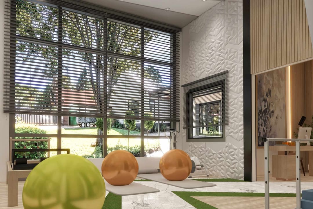
Begin with our Assisted Living Interior Design page, then dive into how wayfinding and color theory help residents navigate with dignity. Operating an assisted living community means shepherding residents, families, and staff through complex buildings while minimizing stress and risk. Poorly designed wayfinding multiplies cognitive load, drains staff time, and can erode residents’ confidence. This guide translates vision science, environmental psychology, accessibility standards, and dementia-informed design into clear rules for color, contrast, signage, and environmental cues so residents can move with dignity and certainty.
20 research-backed critical elements
- Prioritize luminance contrast, not just hue. Aging disproportionately reduces blue–yellow discrimination, so color coding by hue alone is unreliable. Emphasize light–dark contrast that stays legible with age.
Sources: Nature Scientific Reports, Medicine (Baltimore), Vision study
- Use a minimum 30-point Light Reflectance Value difference between critical adjacent surfaces such as doors and walls, floors and walls, and handrails and walls.
Sources: DSDC and BS8300 guidance, DSDC accreditation info, LRV explainer
- Keep adjoining flooring tonally similar to avoid false step illusions. Create strong contrast at floor to wall and door to wall junctions.
Sources: DSDC summary, Kirklees dementia tool
- Avoid busy, glossy, or highly reflective floors which can be perceived as water, holes, or level changes.
Source: Housing LIN Wayfinding and Colour
- Place signs at decision points. Locating signs exactly where a choice must be made improves performance.
Sources: Buildings journal study, Decision-point research abstract
- Follow ADA and Access Board rules for visual and tactile signs. Use non-glare finishes, high contrast, compliant character height and stroke, and tactile or Braille at proper mounting heights.
Sources: Access Board Chapter 7, Access Board signs quick guide
- Size letters for viewing distance. A practical benchmark is about 35 feet of legibility per inch of letter height for average users.
Sources: Access Board legibility research, USSC guideline
- Use clear, robust typography. Favor high x-height fonts, adequate stroke widths, generous spacing. Avoid script and italics. Use mixed case for multiword messages and reserve all caps for short labels when large.
Sources: Buffalo IDEA legibility paper, Access Board stroke thickness rule
- Pair words with standardized healthcare symbols. Pictograms improve comprehension across languages and literacy levels.
Sources: SEGD Universal Symbols, Rousek and Hallbeck
- Align You Are Here maps to the viewer’s facing direction. Forward up alignment reduces mental rotation and decision time.
Sources: Montello YAH paper, Map alignment study
- Design for landmarks. Older adults rely more on salient landmarks than geometric cues. Make destinations visually distinctive.
Sources: eLife landmark study, Ageing and dementia friendly design review
- Use personalized memory boxes at room entries and add distinctive door features to improve room finding in dementia.
Sources: Davis et al. review, Nolan et al. study
- Use color bands or lines only as secondary cues. Never rely on hue alone. Support color coding with strong luminance contrast and symbols.
Sources: NHS case on colored lines, Aging color vision evidence
- Control glare and support contrast with lighting. Older eyes are glare sensitive. Use matte finishes and balanced lighting so signs and edges remain readable.
Source: Access Board non-glare guidance
- Limit visual clutter. Too many messages at one node degrades performance. Test layouts in mockups or VR before rollout.
Source: VR wayfinding experiment
- Make routes continuous and predictable. Provide clear sightlines to the next cue and avoid dead ends in memory care.
Source: Ageing friendly design review
- Design for multilingual audiences. Use plain language with consistent bilingual hierarchy and universal symbols.
Sources: SEGD Universal Symbols, Cross country symbol comprehension
- Use tactile and high contrast cues where appropriate. Follow regional standards for contrast ratios on tactile surfaces and handrails.
Source: Tactile color contrast guide
- Comply with ADA placement and height. Visual characters are typically at or above 40 inches AFF. Tactile and Braille are typically 48 to 60 inches AFF. Place signs on the latch side where applicable.
Source: Access Board Chapter 7
- Evaluate post occupancy and iterate. Field data often reveals misplacements. Reposition signs at true decision points.
Sources: Buildings journal positioning, Hospital signage evaluation
Why wayfinding design is a care issue and not just a graphics task
Poor wayfinding increases anxiety, suppresses participation in daily activities, and wastes staff hours giving directions. Reviews of healthcare wayfinding document measurable effects on stress and operational efficiency. Clear, consistent systems improve experiences for residents, families, and staff.
Sources: Devlin review, Kalantari et al.
At the same time, normal aging changes vision and navigation strategies. Contrast sensitivity declines, glare recovery slows, and blue–yellow discrimination weakens. Older adults rely more on landmarks than on geometric cues. Effective systems combine strong luminance contrast, excellent legibility, standardized symbols, and distinctive environmental features.
Sources: Color vision and aging, Medicine (Baltimore), eLife landmarks
Color theory for ageing vision that actually works
Do not rely on hue alone. Engineer luminance contrast
The S cone pathway is disproportionately affected by age. Even bold hues can converge perceptually. Instead of planning a red wing and a blue wing, plan light versus dark plus shape and symbol. Use instrumented LRV data to confirm differences and target at least 30 point LRV deltas between doors and walls, floors and walls, and handrails and walls. For adjacent flooring materials, keep LRVs close to avoid apparent steps.
Sources: DSDC summary, LRV primer
Calm the floor and clarify the edges
Highly patterned or glossy floors can be misread as holes or water, especially in dementia. Favor matte, low contrast patterns. Make baseboards or skirts and door architraves visually distinct from both floor and wall to declare boundaries.
Source: Housing LIN
Pair color cues with redundant cues
If you color code neighborhoods, add symbols such as leaf, shell, or compass, unique artwork, or thematic millwork so residents can anchor memories to recognizable shapes. Evidence shows improved recognition and room finding in dementia communities.
Sources: Davis et al., Nolan et al.
Signage that seniors can actually read
Meet and exceed ADA fundamentals
Use non-glare materials. Provide light on dark or dark on light contrast. Size characters for viewing distance. Mount tactile and Braille correctly and keep clear space around sign faces.
Sources: Access Board Signs, Access Board signs quick guide
Size for distance with a clear legibility index
As a working rule, assume about 35 feet of legibility per inch of letter height for average readers. Adjust upward for glare or clutter.
Sources: Access Board VMS legibility, USSC guideline
Choose type that helps aging eyes
Select fonts with high x-height, balanced stroke width per ADA stroke ratio, and generous spacing. Avoid scripts and italics. Use mixed case for multiword messages and reserve all caps for short labels when large.
Sources: Buffalo IDEA, Access Board stroke spec
Pair words with symbols and keep them consistent
Standardized healthcare pictograms improve comprehension, even cross culturally. Use the SEGD Universal Symbols set or equivalents and keep icon style consistent.
Sources: SEGD project, Rousek and Hallbeck
Maps, landmarks, and the cognitive load of where am I
Align the map to the viewer’s heading
Forward up You Are Here maps reduce mental rotation and shorten decision time. Place maps only where someone must choose a direction. Include a clear You Are Here dot and landmarks that match reality.
Sources: Montello YAH, Map alignment and landmarks
Make places memorable on purpose
Older adults increasingly lean on landmarks. Give each wing a visual identity such as art themes, color banding with strong luminance contrast, and unique seating or planters.
Sources: eLife lifespan study, Ageing friendly review
Use memory boxes and personalized cues at doors
In memory care, shadow boxes or photo niches at resident doors improve room recognition and reduce anxiety.
Sources: Davis et al., Nolan et al.
Placement and hierarchy: the choreography of signs
Hierarchy. Present primary information such as neighborhood or wing, then secondary such as floor or zone, then tertiary such as room. Keep the order consistent throughout the building.
Placement. Install messages at eye level and exactly at the turn, not several feet past it. Field and VR studies show decision point placement improves performance and reduces pauses.
Sources: MDPI placement, VR experiment
Clutter control. Fewer and clearer signs outperform sign dumps. Test nodes with users and remove anything that is not essential to the move.
Source: VR wayfinding testing
Lighting and materials: make information pop without glare
Older eyes are glare sensitive. Even the best sign fails if it is backlit into veiling luminance or mounted on a glossy wall. Combine matte substrates, indirect lighting, and controlled luminance ratios so signs and edges stand out.
Sources: Access Board non-glare guide, IES RP 28 overview
Special considerations for memory care
- Looped circulation reduces dead end frustration and supports safe wandering.
Source: Ageing friendly review
- De emphasize staff-only exits with neutral tones. Reinforce resident destinations with welcoming color and familiar cues. Door decals and similar graphic strategies can reduce contact with staff doors.
Source: Door decal quality improvement study
- Flooring should avoid high contrast patterns. Keep adjacent LRVs similar and use strong contrast at perimeter edges and door faces.
Source: Housing LIN
Room by room application
Entry and reception
- Clear arrival zone with a primary destination list and a You Are Here map aligned to entry direction.
- Landmark feature wall with unique art and a color band that has high LRV contrast.
- Counterfront contrasts with floor for edge detection.
Corridors
- Consistent color banding, door frames contrasted to walls, and node signage at every choice.
- Resting niches as landmarks every 50 to 75 feet with unique art at each niche.
- Floors with minimal pattern. Adjacent materials have similar LRV and baseboards contrast strongly.
Dining and activity rooms
- Signs at entries set at eye height. Pair a symbol with words, for example fork and knife with the word Dining.
- If using color identity, pair with a recognizable icon. Keep sign faces non-glare.
- Avoid sign clutter at the doorway. Only show the decision needed at that threshold.
Resident rooms
- Personalized memory box with photo or objects. Room number in mixed case with generous letter height on a matte plaque.
- Door leaf contrasts with corridor wall. Hardware contrasts with door leaf.
Toilets and bathing
- Large, high contrast pictogram plus words. Door hardware contrasts at least 30 LRV from the door. Non-glare plaque with consistent placement.
- Reinforce wayfinding with a subtle floor arrow or wall band before the turn into the room.
How HH Designers delivers wayfinding that works and looks like home
- Evidence mapping. We start with user journeys for residents, visitors, and staff, then map decision points against signage, color, and landmarks. Standards such as ADA and the Access Board are the floor, not the ceiling.
- LRV-driven palettes. We measure and record LRV values for floors, walls, doors, handrails, and sign backgrounds and lettering. We hit the 30 point contrasts where they matter and minimize them where continuity is safer, such as adjacent floors.
- Mockups and trials. Before rollout, we install temporary sign families at representative nodes and observe users, including those with low vision or cognitive impairment. We remove clutter, resize type, and fix placement at true decision points.
- Universal symbol set plus plain language. We pair SEGD universal symbols with large, plain language labels in mixed case. Typography meets legibility best practices and stroke to height guidance.
- Glare control. We select matte substrates and coordinate lighting so signs and edges remain readable day and night.
- Spec Book and maintenance. We hand over LRV records, sign schedules, mounting diagrams, and a simple clutter policy. Nothing new gets posted at a node unless something else is removed.
Quick specification checklist
- Contrast. At least 30 point LRV between floors and walls, doors and walls, and handrails and walls. Keep adjacent flooring LRVs similar.
Source: Forbo and DSDC
- Color strategy. Prefer luminance contrast and symbols over hue only coding. Remember that blue–yellow discrimination declines with age.
Source: Nature Scientific Reports
- Signage. Non-glare faces, high contrast, character sizing via about 35 feet per inch legibility, compliant stroke and height, tactile and Braille at correct heights.
Sources: Access Board, Access Board legibility
- Typography. High x-height, adequate stroke, mixed case for phrases, avoid scripts and italics.
Source: Buffalo IDEA
- Maps. You Are Here maps aligned to viewer heading with landmarks that match reality.
Source: Montello
- Landmarks and memory boxes. Distinctive features plus personalized boxes at resident rooms, particularly in memory care.
Source: Davis et al.
- Testing. Mock up decision points, remove visual clutter, confirm readability in real lighting conditions and with typical eyewear.
Source: VR testing paper
Outcomes you can expect
- Lower cognitive load and anxiety. Environments that present the right cue at the right time reduce hesitation and stress.
Source: Devlin review
- More independent navigation. Landmark rich, contrast legible, symbol supported systems help residents including those with mild cognitive impairment or dementia get where they want to go with less staff assistance.
Sources: eLife landmarks, Dementia cueing review
- Operational wins. Clear decision point signage reduces interruptions and back and forth directions, which returns time to caregiving.
Source: Implementation study